
Someone may see your van while passing it in traffic, driving through an intersection, or walking past it at a job site. They are unlikely to stop and read paragraphs of information.
That means an effective commercial wrap has to do three things quickly:
- Identify the business
- Communicate what the business does
- Make the brand easy to recognize and remember
The challenge is that designing for a vehicle is very different from designing a website, flyer, or billboard. A vehicle is three-dimensional, full of body lines, doors, windows, handles, wheel arches, and moving surfaces.
At It’s aWrap™, we’ve worked with businesses and fleets throughout the GTA for more than 15 years. Here are some of the most common commercial wrap design mistakes we recommend avoiding before anything goes to print.
1. Trying to Put Too Much Information on the Vehicle
This is probably the most common commercial-wrap design mistake.
Business owners understandably want to include everything:
- Company name
- Logo
- Phone number
- Website
- Email address
- Social media handles
- Every service offered
- Slogans
- Certifications
- Years in business
- Promotions
The problem is that when everything is important, nothing has visual priority.
A person passing your vehicle at 50 km/h doesn’t have time to process ten separate messages.
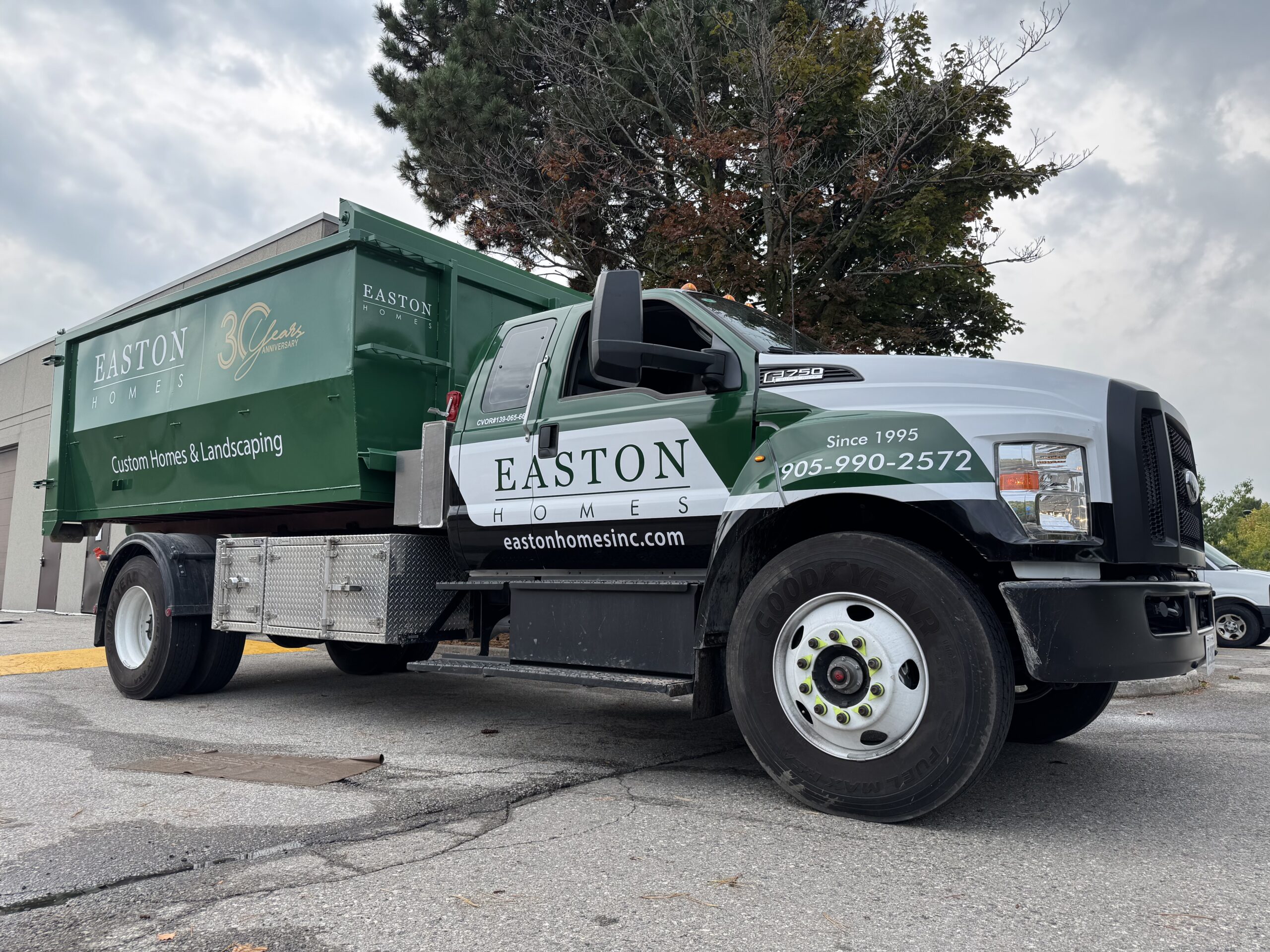
Better approach: Establish a clear information hierarchy. In most cases, the business name or logo should dominate, followed by what the company does and one practical way to identify or contact the business.
2. Making the Logo Too Small
Your commercial wrap should primarily build recognition for the business behind it.
Yet some designs give more space to decorative graphics or stock photography than to the actual company name.
A logo that looks perfectly reasonable on a computer screen may become insignificant once it is placed across the side of a full-size cargo van.
Better approach: Design for the viewing distance. The business identity should remain recognizable from across an intersection or parking lot—not only when someone is standing beside the vehicle.
3. Listing Every Service You Offer
A long service list is usually difficult to read and can quickly make a commercial vehicle look cluttered.
For example:
Too much:
Furnaces • Air Conditioners • Heat Pumps • Boilers • Ductless Systems • Humidifiers • Water Heaters • Maintenance • Repairs • Installations • Emergency Service
Someone passing the vehicle probably won’t read most of it.
Better approach:
Use a clear category such as Heating & Cooling and reserve the detailed service list for your website.
If one or two services are strategically important, they can receive additional emphasis without turning the vehicle into a directory.
4. Ignoring How the Vehicle Will Be Viewed in Motion
A commercial wrap isn’t a brochure.
Much of the audience will see it while:
- Driving past the vehicle
- Following it in traffic
- Passing through an intersection
- Seeing it briefly from another lane
That means the design needs to communicate extremely quickly.
Small text, lengthy slogans, complicated illustrations, and multiple competing messages may work while studying a static mockup but fail completely on the road.
Better approach: Step back from the design and ask what someone could realistically understand within two or three seconds.
5. Using Weak Contrast
A visually attractive colour palette does not automatically produce a readable commercial wrap.
For example:
- Light grey text on white
- Dark blue text over black
- Yellow lettering over a detailed photograph
- Multiple similar colours competing in the same section
can make important information disappear at a distance.
Better approach: Maintain strong contrast between important text and its background. Your company name, service category, phone number, or website should remain legible under different lighting conditions.
6. Designing the Vehicle as if It Were a Flat Rectangle
This is one of the biggest differences between general graphic design and professional vehicle-wrap design.
A vehicle contains:
- Door seams
- Handles
- Wheel arches
- Fuel doors
- Body contours
- Recesses
- Mouldings
- Windows
- Sliding doors
- Lights
A design that looks perfect on a flat template can become awkward once those elements interrupt the artwork.
A phone number may be split across two doors. A person’s face may land directly over a door handle. A logo may curve around a wheel arch and become difficult to recognize.
Better approach: Design around the actual vehicle architecture from the beginning rather than trying to force a flat advertisement onto it afterward.
7. Putting Important Information Across Door Seams and Handles
Doors open. Sliding doors move. Handles interrupt graphics.
That sounds obvious, but it is surprisingly easy to overlook when working from a digital template.
Critical information positioned across moving sections can become:
- Difficult to read
- Misaligned when doors are open
- Interrupted by handles
- Visually distorted by panel gaps
Better approach: Keep logos, phone numbers, websites, and critical text within cleaner areas whenever the vehicle layout allows it.
8. Using Low-Resolution Images or Poor Logo Files
Commercial graphics are printed at a much larger scale than most digital marketing materials.
A small logo downloaded from a website may look fine on a monitor but become blurry or pixelated when enlarged across the side of a van.
The same problem occurs with low-resolution photographs.
Better approach: Supply original vector logo files whenever possible, such as AI, EPS, SVG, or print-ready PDF artwork. Photographic elements should also have sufficient resolution for their final printed size.
If you’re unsure whether your files are suitable, your wrap designer should evaluate them before the design process gets too far.
9. Using Too Many Fonts
Typography can quickly make an otherwise professional wrap look inconsistent.
Using one font for the company name, another for services, another for the phone number, another for the slogan, and another for the website creates unnecessary visual noise.
Better approach: Use your established brand typography where practical and keep the overall font system restrained.
Readability matters more than choosing an unusual typeface.
10. Choosing Style Over Readability
Commercial wraps should look good, but their primary purpose isn’t to win a graphic-design competition.
An elaborate script font may look premium but become unreadable from twenty metres away. A highly detailed background may look impressive close up but make the company name disappear.
Better approach: Evaluate every design decision against the same question:
Does this make the business easier or harder to recognize?
If an element makes the design harder to understand, it probably isn’t helping.
11. Forgetting the Rear of the Vehicle
The sides usually receive most of the design attention, but the rear of a commercial vehicle can be extremely valuable.
Drivers may spend several minutes directly behind your van or truck in traffic.
The rear can therefore be an appropriate place for:
- Business name
- Logo
- Short service description
- Website
- Phone number
That doesn’t mean filling every centimetre with information. The same hierarchy and readability principles still apply.
12. Making Contact Information Too Difficult to Remember
Your phone number or website may only be visible briefly.
That makes readability especially important.
A complicated URL with multiple words, hyphens, or subdirectories isn’t ideal for vehicle graphics. Likewise, tiny contact information buried beneath six other lines of text is unlikely to be useful.
Better approach: Use the simplest contact point your business has and make it easy to identify.
For many companies, a memorable domain name works particularly well because someone can search the business later even if they don’t remember every character.
13. Assuming a QR Code Will Solve Everything
QR codes can work on vehicles, but they shouldn’t become the foundation of the design.
A QR code is most useful when the vehicle is stationary—for example, parked at a job site or event.
Drivers should never be expected to scan a moving vehicle.
Better approach: Treat a QR code as optional secondary information. Your brand and core message should still work perfectly without it.
14. Ignoring Brand Consistency
Your commercial vehicle should look like it belongs to the same company as your website, uniforms, business cards, signage, and social profiles.
If your vehicles use completely different colours, fonts, or logo treatments, customers may have a harder time connecting those touchpoints.
Consistency becomes even more important as your fleet grows.
A customer should be able to see different vans in different parts of the city and immediately recognize them as belonging to the same company.
That’s one of the reasons commercial wraps can support long-term brand recognition. We cover that broader business value in our guide to the benefits of commercial vehicle wraps.
15. Designing Each Fleet Vehicle Independently
A Sprinter van, pickup truck, Transit Connect, and box truck obviously can’t use an identical layout.
But that doesn’t mean every vehicle should look like a completely different campaign.
Better approach: Create a scalable visual system.
Important elements such as:
- Logo treatment
- Primary colours
- Typography
- Service descriptor
- Graphic style
should remain consistent even when their positioning changes to accommodate different vehicles.
This allows a mixed fleet to feel like one cohesive brand.
16. Choosing a Design Without Considering Installation
Not every design is equally practical to install.
Complex colour transitions, highly precise alignment between multiple panels, detailed graphics around deep recesses, and excessive edge-to-edge elements may require considerably more installation work.
A professional designer who understands vehicle wrapping can account for:
- Panel overlaps
- Seams
- Stretch
- Recesses
- Body contours
- Areas requiring separate pieces
That collaboration between design and installation can make a major difference in the finished product.
17. Designing Without Thinking About Future Fleet Growth
If you’re wrapping your first company vehicle but expect to add more vehicles later, think ahead.
Your design should be easy to adapt to:
- Different vans
- Pickup trucks
- Trailers
- Box trucks
- Additional service divisions
A scalable design system reduces the likelihood that every new vehicle needs to be reinvented from scratch.
18. Using Temporary Promotions as Permanent Wrap Elements
Vehicle wraps can remain installed for years, so permanently incorporating a short-lived promotion can create problems later.
Examples include:
- Temporary discounts
- Limited-time offers
- Specific seasonal promotions
- Dates
- Products or services likely to change
Better approach: Keep the primary wrap relatively evergreen. Temporary offers can be added using separate removable graphics when appropriate.
19. Forgetting About Wrap Maintenance During the Design Stage
Design and maintenance may seem unrelated, but certain choices can make dirt and wear more noticeable.
Large areas of very dark film, for example, can make dust, salt residue, and water spotting more apparent than some lighter designs.
Regardless of colour, a commercial vehicle represents your business. Keeping it clean matters.
For proper aftercare, see our commercial vehicle wrap maintenance guide.
20. Choosing the Cheapest Design and Installation Option
A commercial vehicle is a highly visible representation of your company.
Saving money by compromising on artwork, print quality, film, or installation can create issues that are visible every time the vehicle is on the road.
At the same time, the most expensive wrap isn’t automatically the best one.
The goal should be a design that is:
- Readable
- On-brand
- Appropriate for the vehicle
- Professionally printed
- Properly installed
- Suitable for how long you expect to use it
If you’re budgeting for a project, our commercial vehicle wrap cost guide explains the factors that affect pricing.
What Should a Good Commercial Wrap Include?
There is no universal formula, but most effective commercial vehicle designs include a relatively small number of important elements.
| Element | Priority | Purpose |
|---|---|---|
| Business Name / Logo | Highest | Brand recognition |
| What You Do | High | Immediately communicates the service category |
| Brand Colours | High | Creates visual consistency |
| Website / Phone | Secondary | Provides a way to find or contact the business |
| Supporting Graphics | Secondary | Strengthens the visual identity without competing with the message |
Everything else should earn its place in the design.
Full Wrap, Partial Wrap or Lettering?
Good commercial design also doesn’t automatically mean covering the entire vehicle.
Depending on the brand and budget, a business may be better served by:
- Full vehicle wrap
- Partial wrap
- Printed graphics
- Cut vinyl lettering
- A combination of wrap and lettering
A clean partial wrap with excellent hierarchy can communicate more effectively than a poorly designed full wrap.
Our commercial vehicle wrap services include solutions for individual company vehicles and fleets.
Review the Design at Realistic Scale Before Approving It
Before approving the final artwork, don’t only examine it zoomed in on a monitor.
Reduce the mockup until the vehicle is relatively small on screen.
Then ask:
- Can I still identify the company?
- Can I tell what the company does?
- Is the main message obvious?
- Does anything look cluttered?
- Are important elements competing?
- Can I read the important information quickly?
If the design only works when enlarged on a computer screen, it probably needs more refinement.
Look at Real Commercial Wrap Projects
One of the best ways to plan your own project is to look at completed vehicles rather than flat templates alone.
Real installations show how branding interacts with wheel arches, doors, body lines, windows, handles, and the overall proportions of the vehicle.
You can browse examples of our commercial and automotive work in the It’s aWrap™ portfolio.
Commercial Vehicle Wrap Design in Mississauga
At It’s aWrap™, we’ve been designing and installing vehicle graphics in Mississauga since 2010.
We work with businesses ranging from single-vehicle operations to larger fleets and approach commercial wraps as both a branding project and an installation project.
The goal isn’t to fill every available panel. It’s to create a vehicle that looks professional, communicates quickly, and remains recognizable wherever the business operates.
If you’re planning a new commercial vehicle or updating an existing fleet, explore our commercial and fleet wrapping services.
Contact It’s aWrap™ to discuss your commercial wrap design and installation.
Final Thoughts
The most effective commercial wraps are rarely the ones with the most information.
They are the ones that make the business easy to recognize, easy to understand, and easy to remember.
Prioritize the brand, keep the message clear, design around the actual vehicle, use strong contrast, and make every element justify the space it occupies.
A commercial wrap should still look good when someone is standing beside it—but more importantly, it should make sense when they only have a few seconds to see it.