
Colour is one of the first things people notice about a commercial vehicle wrap. Before someone reads your company name, phone number or services, the overall colour palette has already created an impression.
That makes colour an important part of commercial vehicle branding—but choosing effective colours involves more than simply deciding that red means excitement or blue means trust.
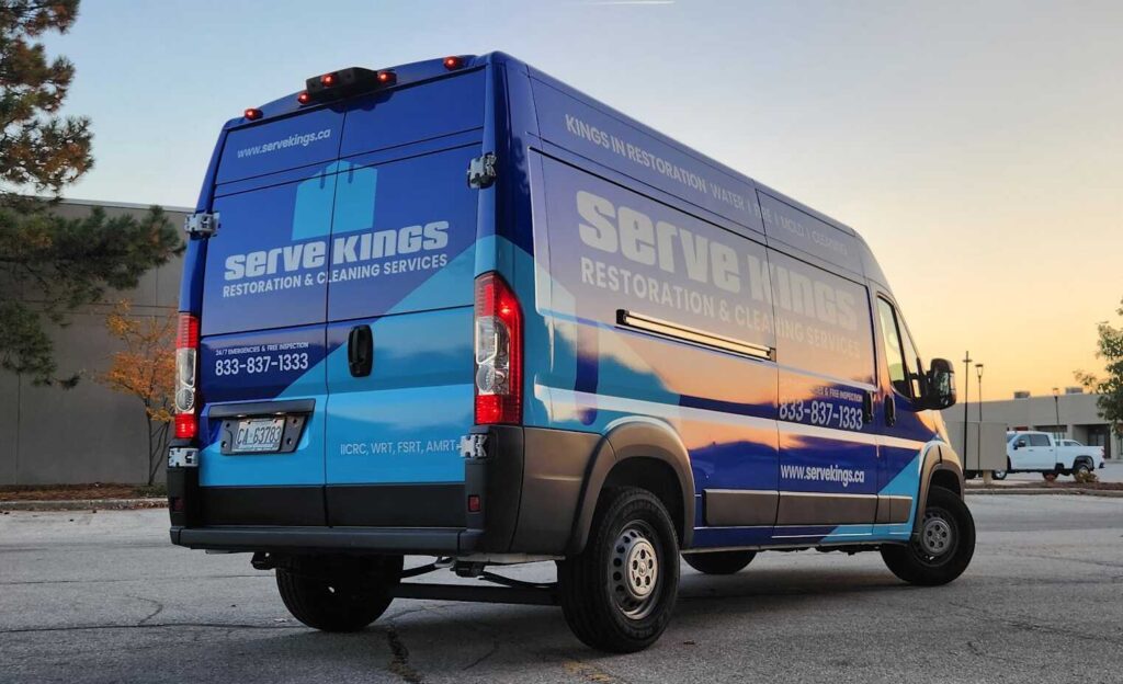
When we work with commercial vehicles at It’s aWrap, colour has to perform several jobs at once. It needs to represent the existing brand, create enough contrast for important information to remain readable, work with the shape and original colour of the vehicle, and remain recognizable when the vehicle is moving through traffic.
Understanding basic colour psychology can help, but the best commercial wrap designs combine psychology with practical design decisions.
What Is Colour Psychology?
Colour psychology refers to the ways colours can influence perception, emotion and associations. Businesses have long used colour as part of their visual identities because people can develop strong associations between particular colours and particular brands.
However, colour does not have one universal meaning.
How someone responds to a colour can depend on context, culture, industry, surrounding colours and personal experience. A bright red used by a restaurant creates a very different impression from the same red used as an accent on a luxury black vehicle.
For commercial vehicle wraps, it is therefore better to treat colour psychology as a design consideration rather than a rigid formula.
The goal is not simply to choose a colour with the “right” psychological meaning. The goal is to create a vehicle that people notice, understand and eventually associate with your business.
How Different Colours Can Influence a Vehicle Wrap
Although context matters, different colours do carry common visual associations that can be useful when developing a commercial wrap.
Red: Energy and Attention
Red is visually powerful and naturally attracts attention. It is commonly associated with energy, excitement, speed and intensity.
That can make it effective for automotive businesses, restaurants, fitness companies, entertainment brands and businesses that want a more aggressive visual identity.
But more red is not necessarily better. On a commercial vehicle, large areas of saturated red combined with excessive text and graphics can become visually overwhelming.
Using red strategically as an accent against a contrasting background can sometimes create a stronger hierarchy than making the entire vehicle red.
Blue: Professionalism and Stability
Blue is widely used in corporate branding and can create a clean, established and professional appearance.
It is common among financial, technology, home-service, healthcare and professional-service businesses.
For vehicle graphics, darker blues can create a more conservative or premium appearance, while brighter blues can feel more energetic and contemporary.
Yellow: Visibility and Energy
Yellow is extremely noticeable, particularly when paired with darker colours.
That high contrast can make it useful when visibility is a major objective. Construction companies, trades, service businesses and brands with an energetic identity can use yellow effectively as either a dominant colour or an accent.
The challenge is readability. Yellow text on a white or similarly bright background, for example, can lose much of its impact. Contrast matters just as much as the colour itself.
Green: Nature, Growth and Freshness
Green is commonly associated with nature, sustainability, health and growth.
Landscaping companies, environmentally focused businesses, food brands and wellness companies often use it for that reason.
But green also has considerable range. A bright lime green creates a completely different personality from a deep forest green, so shade selection matters.
Black: Premium and Bold
Black can create a strong, sophisticated appearance and works particularly well when a business wants its vehicles to feel premium.
It also provides an excellent background for high-contrast white, metallic or brightly coloured graphics.
Luxury services, automotive businesses, fashion brands and premium contractors can all make effective use of black, but readability needs to remain the priority when darker secondary colours are incorporated.
White: Clean and Minimal
White creates visual space and can communicate simplicity and cleanliness. It is also extremely practical because many commercial vehicles already come from the factory in white.
That creates an opportunity businesses sometimes overlook.
Instead of wrapping an entire white van, the factory paint can become part of the design. Strategically placed graphics or a partial wrap can use the existing white as negative space, potentially reducing the amount of vinyl required while still producing a complete-looking design.
Orange: Energetic and Distinctive
Orange is highly visible and tends to create an energetic, approachable appearance. It can work particularly well for construction, home services, creative companies and brands that want something less conventional than red or blue.
Like yellow, it often performs best when paired with a strongly contrasting colour that keeps text and branding easy to read.
Colour Psychology Is Only Part of an Effective Commercial Wrap
A common mistake in commercial wrap design is concentrating so heavily on appearance that the vehicle stops functioning effectively as advertising.
A vehicle can have beautiful colours and still be a poor commercial wrap.
If someone cannot quickly determine the company name or what the business does, the design has missed an important part of its purpose.
Before approving a commercial wrap, we recommend looking at four factors together:
- Brand consistency: Does the vehicle actually look like the same company customers see online, on signage and in other marketing?
- Contrast: Can the important information be read easily against the background?
- Hierarchy: Does the viewer immediately know what to look at first?
- Visibility: Will the design still work when viewed from across a parking lot or while the vehicle is moving?
These principles are particularly important because many of the most common commercial wrap design mistakes come from trying to communicate too much at once.
Should You Always Use Your Existing Brand Colours?
Usually, your existing brand identity should be the starting point.
If customers already associate your company with a particular colour palette, completely changing those colours on your vehicles can weaken consistency.
Your website might be blue and white, your storefront might be blue and white, and your uniforms might be blue and white. If your commercial vehicles suddenly become predominantly orange and black without a strategic reason, they may feel disconnected from the rest of the brand.
That doesn’t mean a vehicle wrap has to copy your website exactly.
A vehicle is a completely different format. Designers can adjust the proportion of colours, introduce complementary accents and increase contrast while preserving the core identity.
This is one of the major advantages of a custom commercial wrap design: the artwork can be adapted to the vehicle without abandoning the branding that customers already recognize.
Contrast Matters More Than Simply Choosing a Bright Colour
One of the most important practical considerations in commercial vehicle design is contrast.
A bright colour isn’t automatically easy to see.
Bright yellow lettering against white can be difficult to read. Dark blue lettering against black may disappear from a distance. A photograph placed behind a phone number can introduce so much visual detail that the number becomes difficult to process.
Strong contrast creates separation between important information and its background.
For example:
- White lettering against a dark background
- Black lettering against yellow or another bright background
- A bright accent colour against black
- A simple logo surrounded by sufficient negative space
The exact combination depends on the brand, but the principle remains the same: the information that matters most needs enough visual separation to be understood quickly.
Think About How the Vehicle Will Actually Be Seen
Commercial wrap artwork is usually designed on a computer while the vehicle template is sitting perfectly still.
Customers rarely see it that way.
They might see the van travelling beside them for three seconds. They might see the rear doors while stopped at a traffic light. They might only see one side while the vehicle is parked outside a customer’s home.
That changes how colour should be used.
Large blocks of contrasting colour can help divide the design into recognizable sections. A distinctive accent can make an otherwise simple fleet recognizable. A consistent colour treatment across several vehicles can help customers identify the company before they even read the logo.
For businesses operating multiple vehicles, this consistency is one reason fleet wraps can be valuable for brand visibility. Each vehicle reinforces the same visual identity as it travels through different parts of the service area.
Don’t Forget the Vehicle’s Original Paint Colour
The existing colour of the vehicle can have a major impact on commercial wrap design, particularly for partial wraps and graphics.
If a company operates white vans and white is already part of its branding, the original paint can become part of the composition.
If the vehicle is black, the designer may be able to use that black as the background and introduce lighter graphics rather than covering every panel.
On the other hand, an original paint colour that clashes with the brand may require additional coverage to create a cohesive result.
This is why the same commercial wrap concept cannot always be transferred unchanged from one vehicle to another.
Colour Selection for a Mixed Commercial Fleet
Fleet branding becomes more complicated when a business operates several different makes, models and colours of vehicles.
The objective should be consistency without forcing identical artwork onto completely different shapes.
A pickup truck does not have the same usable surfaces as a cargo van. A compact service vehicle may have far less room for messaging than either.
Instead, the recognizable elements should remain consistent:
- Core brand colours
- Logo treatment
- Typography
- Graphic style
- Overall visual hierarchy
The exact positioning can then change according to each vehicle.
This creates a fleet that looks coordinated without compromising the design simply to make every vehicle identical.
How Many Colours Should a Commercial Vehicle Wrap Use?
There is no fixed number, but adding colours without a clear purpose can make a commercial wrap harder to understand.
For many businesses, an effective system consists of a dominant base colour, a secondary brand colour and one accent. Other brands may require more because their established visual identity already uses a broader palette.
The key is hierarchy.
If every colour is equally dominant, every piece of text is large and every graphic is competing for attention, nothing actually stands out.
Colour should help organize the message rather than make the design busier.
What Should Be the Most Visible Part of Your Vehicle Wrap?
For most service businesses, the company name or logo should be one of the first things someone notices, followed closely by an indication of what the company actually does.
Contact information is important, but it doesn’t necessarily need to dominate every panel.
Think about the sequence:
Who are you? → What do you do? → How can I find you?
Colour and contrast can guide the viewer through that sequence.
This is much more useful than trying to make the phone number, website, social handles, list of services, slogan, certification logos and promotional offer all equally prominent.
Commercial Vehicle Wrap Design in Mississauga
A successful commercial wrap should look good parked in front of your business, but it also needs to function when the vehicle is actually being driven.
At It’s aWrap, our approach to commercial vehicle wraps in Mississauga considers the existing brand, vehicle shape, coverage, colour relationships, readability and how the finished vehicle will represent the company on the road.
That could mean a bold full wrap for one company and a much cleaner partial design for another. The right solution depends on the brand rather than following a universal template.
Final Thoughts: Choose Colours for the Brand, Not Just the Vehicle
Colour psychology can be a useful tool when designing a commercial vehicle wrap, but it shouldn’t override the fundamentals of good branding.
Red doesn’t automatically make a business exciting. Blue doesn’t automatically make customers trust it. And choosing the brightest colour available doesn’t guarantee that people will remember the vehicle.
The strongest designs use colour intentionally—to reinforce an existing identity, establish contrast, organize information and make the business recognizable.
If you’re planning a commercial wrap or fleet graphics and aren’t sure how your existing branding will translate onto a vehicle, contact It’s aWrap to discuss the design, coverage and vehicle before production begins.